
Design Theory
Visual balance is essential to good design because it provides a sense of unity, order, and equilibrium. Designs need to visually “hold together” in order to feel complete and congruent. The visual weight of objects, space, and color should be equally distributed across the design to achieve balance.
Balance
Balance is the equal distribution of visual weight in a design. Think of standing on one foot; you can adjust your core, arms, and other leg into different positions to keep from falling. Two forms of balance are symmetrical and asymmetrical. Symmetrical balance is created by repeating the reverse of a design on the opposite side of an axis. Think of it as mirroring the image on the other side. Asymmetrical balance is created by elements that are of equal weight but not identical to each other.
Symmetrical Balance
Elegant. Formal. Conservative.
Asymmetrical Balance
Abstract. Tension. Contrast.

Radial Balance
Circular. Centered. Focused.
Crystallographic Balance
Mosaic. Repetition. Balance.
Hierarchy
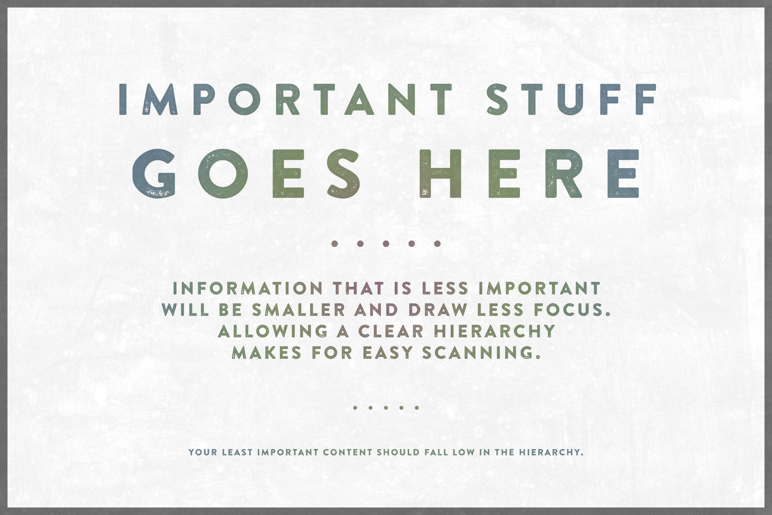
Using visual hierarchy allows your content to be scanned while communicating the relative importance of different parts. It is likely that you are already demonstrating some form of hierarchy by using headers, paragraphs, and bullet points. Use hierarchy to move the eye from the most important elements to the least.
Space
Space is the area the design will take place on. It can be used to show depth and perspective, and imply a three-dimensional image on a two-dimensional area. For example, two objects that are different sizes. The larger image appears closer than the smaller image. You can use space to create emphasis and hierarchy. White space is just as important as the objects in the design; it helps direct the eyes of the viewer. The more space there is around an object, the easier it is to notice. You can also use white space to give the eyes a rest, allowing the viewer to absorb the meaning and intention of something.
COntrast
Contrast emphasizes the differences between elements in a design. Contrast can be created with color, size, type, space, and other elements. It is another way to direct focus, create organization, and invoke impact. A good use of high contrast is between the color of your text and the background. It makes your copy readable. If there is an element that is less important, you can use low contrast so it is not emphasized.
